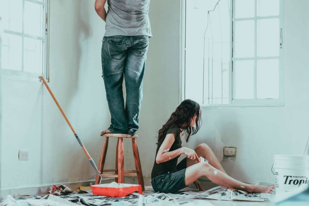
Most Columbus homeowners are updating cabinet colors to match local light and resale expectations, and you can choose hues that enhance your space and value. In this guide, you’ll discover why warm whites and soft greys are popular for brightening rooms and appealing to a broad audience, how deep navy and natural wood tones create sophisticated contrast, and why very dark or neon colors can visually shrink rooms and deter buyers, ultimately helping you choose the best option for your home.
Key Takeaways:
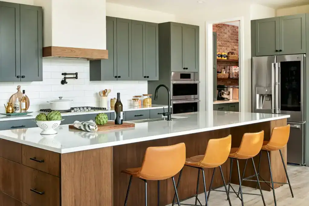
- Warm neutrals and natural wood tones (maple, walnut, soft greiges) are widely favored in Columbus, pairing well with both historic bungalows and newer builds and supporting resale value.
- Deep blues and greens for islands or lower cabinets provide a stylish, high-contrast focal point when balanced with light countertops and ample natural light common in local homes.
- Two-tone schemes and durable, low-maintenance finishes (painted uppers with stained lowers or mixed materials) offer a modern look that stands up to the Midwest climate and daily use.
The Color Psychology of Cabinets: Setting the Mood
Warm Tones: Inviting Comfort and Coziness
Warm cabinets in cream, buttery beige, terracotta, or natural maple give your kitchen a welcoming, lived-in feel that buyers in Columbus often seek. Pair warm tones with 2700–3000K warm lighting, brass or aged bronze pulls, and wood-grain countertops to amplify comfort; farmhouse-style backsplashes in subway tile or warm travertine reinforce the look. Watch out for deep, saturated browns in small, north-facing kitchens—those can make the space feel closed-in rather than cozy.
Cool Tones: Fostering Tranquility and Modernity
Cool blues, soft grays, and slate tones create a calm, contemporary backdrop that suits Columbus condos and updated bungalows; think Benjamin Moore Hale Navy (HC‑154) for anchors or Sherwin‑Williams Sea Salt (SW 6204) for airy uppers. Combine cool cabinets with chrome or matte-black hardware and 3500–4100K neutral-to-cool lighting to preserve crispness, and avoid painting an entire small kitchen in the darkest hues to prevent a boxed-in feel.
For deeper application, you can use cool tones to execute a two-tone scheme—navy lowers with off-white uppers are a common local choice that balances drama and resale appeal. Architects and designers in neighborhoods like German Village and Victorian Row often pair a Hale Navy lower bank with warm wood islands or brass accents to keep the room grounded; that contrast helps the navy read intentional rather than overpowering. In open-plan Columbus homes, cool cabinets work best when tied to other elements: stainless appliances, light quartz countertops (look for ~92% light reflectance), and larger windows. If your kitchen faces north, introduce reflective surfaces or a lighter cool shade like Sea Salt to maintain brightness; for south-facing rooms, you can push toward richer slate or blue-greens without sacrificing warmth.
Trend Spotlight: Neutrals Are Not Just Boring
The Reign of Soft Grays and Beiges
Soft grays and warm beiges—think Benjamin Moore Revere Pewter (HC‑172) or Sherwin‑Williams Mindful Gray (SW 7016)—continue to dominate Columbus kitchens because they adapt to varied light and pair beautifully with maple or walnut. You can combine these tones with warm brass hardware and honed marble to keep a historic bungalow feeling fresh, while lighter cabinet faces help reflect northern light in shaded rooms.
Bold Neutrals: Blacks and Charcoals for a Sophisticated Edge
Deep charcoals and true blacks—Sherwin‑Williams Tricorn Black (SW 6258) or Iron Ore (SW 7069)—give you dramatic contrast on islands or lower runs, especially against white countertops and warm wood floors. Designers in Clintonville often specify matte or satin black cabinetry with brushed brass pulls to balance warmth, but be aware that dark finishes show dust, fingerprints, and scratches more easily.
When you choose black or charcoal, specify a durable furniture-grade finish: professionals typically apply a shellac or adhesion primer followed by two coats of acrylic enamel and a protective topcoat, often sprayed for a factory-smooth surface. Pick a satin or low‑sheen finish to hide minor wear; high‑gloss looks striking but highlights imperfections. Add layered lighting—under‑cabinet LEDs at ~3000K and pendant task lights over the island—to prevent the space from feeling closed in. For hardware, warm metals like brass or aged bronze create the most appealing contrast, and routine microfiber dusting keeps the look crisp without much extra work.
Color of the Year Influences in Columbus
How 2023’s Color of the Year is Shaping Local Design
Designers across Columbus responded quickly to Pantone’s 2023 Color of the Year, Viva Magenta (18-1750), using it as an accent on islands, open shelving backs, and hardware finishes rather than full cabinetry. You’ll see the hue pop in Short North kitchens and contemporary updates in German Village, where small injections—painted drawer fronts or a single pantry door—give homes a bold, contemporary lift without overwhelming period details.
Integrating Seasonal Trends into Timeless Designs
Mix trend colors into your design through reversible or replaceable elements: try a painted island, removable door panels, or washable peel-and-stick backsplashes so the look can evolve each season. Limit dramatic hues to 10–20% of visible cabinetry to keep the scheme enduring; overuse of a saturated tone can make a kitchen feel dated quickly.
Practical tactics help you test trends without a full renovation: paint 12 “x12” cabinet samples and view them at morning and evening light, swap just the lower doors or an island, or choose hardware in a magenta-leaning finish for a subtle tie-in. You can also work with a local painter who offers color-matching services and water-based cabinet enamel for durability. Many Columbus pros recommend sampling for 1–3 months before committing to a full-cabinet color change, so you can assess wear, cleaning, and how the hue reads with your flooring and natural light.
Going Beyond the Basics: Custom Cabinet Colors
The Rise of Unique Finishes: Matte vs. Gloss
You’ll notice matte finishes dominating contemporary Columbus kitchens because they soften light and hide minor surface flaws; typical sheen ranges help you choose—matte (0–10%), satin (~20–35%), semi-gloss (40–70%), and high-gloss (>70%). High-gloss reflects light to enlarge a space but can show scratches and fingerprints, while matte creates a tactile, designer look that many homeowners pair with brass hardware to add contrast.
Mixing Materials: Painting Wood vs. Metal Cabinets
Wood accepts paint and stain more forgivingly—sand to 120–150 grit, apply a quality bonding primer, then two topcoats—whereas metal needs a self-etching or rust-inhibiting primer and a durable topcoat like a two-component epoxy or waterborne polyurethane; failure to properly prime metal risks rust and peeling, so plan for extra prep time.
For mixed kitchens—painted wood uppers with a powder-coated steel island, for example—match gloss levels to reduce visual discord: use satin or low-sheen urethane on wood and a complementary matte or satin finish on metal. Aim for one light coat of etching primer on metal, then two topcoats (20–30 wet mils total), and on wood, apply one coat of high-adhesion sanding primer plus two finish coats. Sand between coats with 220–320 grit, allow 24 hours flash time between coats, and a full cure of 7 days before heavy use. If you’re updating vintage steel cabinets, test a small area first and consider professional spray application for uniform coverage and to avoid brush marks.
Environmental Impact: Sustainable Cabinet Color Choices
Eco-Friendly Paints: What to Look For
Choose paints with VOC levels under 50 g/L or labeled “zero‑VOC” to cut indoor emissions; look for Green Seal or GREENGUARD certification and SCAQMD Rule 1113 compliance for commercial specs. Water‑based alkyds deliver oil‑like durability with lower solvents, and you should review the technical data sheet because tint bases can raise VOC content. Selecting certified low‑emission finishes can help you earn LEED credits and protect sensitive household members.
The Demand for Reclaimed Wood in Colorful Designs
Reclaimed wood—often salvaged from barns and warehouses aged 50–150 years—adds texture and history to painted or stained cabinets while reducing demand for new lumber. You should have reclaimed boards inspected for lead paint, embedded nails, and insect damage before finishing; expect suppliers to charge roughly 10–40% more than commodity lumber, depending on scarcity and milling needs.
Using reclaimed material cuts the need for freshly harvested timber and diverts useful material from landfills, and many designers report project embodied‑carbon reductions compared with new millwork. You should ask suppliers for provenance and whether boards were kiln‑dried and de‑nailled; milling and stabilization commonly add several dollars per board foot, but prevent warp and hidden metal damage. For bold color applications, try a pigmented stain or milk paint over properly sealed reclaimed planks to preserve grain while achieving saturated hues—contractors in Columbus often pair reclaimed oak with muted navy or sage to balance patina and modern color trends.
Regional Inspirations: The Columbus Aesthetic
Midwestern Charm: Rustic Hues and Vintage Touches
Neighborhoods like German Village and parts of Clintonville inspire you to choose brick-red, warm taupe, muted sage, and buttercream for cabinetry, pairing reclaimed-wood open shelving and antique brass hardware to echo cobblestone streets and farmhouse porches. Consider a two-tone scheme—darker base cabinets with lighter uppers—to preserve light in compact Columbus kitchens while keeping that lived-in, vintage character.
Inspired by Local Art and Architecture: Unique Color Palettes
Short North murals, the Columbus Museum of Art, and historic storefronts push you toward bolder, curated palettes—think deep teal, charcoal, and mustard accents—balanced with soft neutrals so your cabinets read like an intentional gallery wall rather than an overpowering block of color. Keep in mind that very dark tones can make small kitchens feel smaller, so plan contrast and lighting carefully.
Local designers often use the 60/30/10 rule when translating art-driven palettes into cabinetry: 60% neutral (off-white or warm beige), 30% dominant cabinet color (navy, charcoal, or forest), and 10% accent (brass pulls, painted island, or open-shelf backs). Use durable finishes—semi-gloss or satin—on high-touch cabinetry for easy cleaning, and try pairing Benjamin Moore’s rich navy (Hale Navy) or Sherwin-Williams’ Iron Ore on lower cabinets with a lighter Benjamin Moore Affinity or Sherwin-Williams Accessible Beige on uppers to mimic the contrast seen in Short North facades.
Practical Tips for Choosing the Right Color
- Map your cabinet color choices against actual light: test swatches in morning, midday, and evening light; colors can shift up to two shades between daylight and warm bulb illumination.
- Match undertones to existing surfaces: compare swatches to countertop, flooring, and backsplash samples to avoid clashing warm vs cool tones.
- Use the 60-30-10 rule: let cabinets occupy roughly 60% of the visual field, secondary finishes 30% and accents 10% for a balanced composition.
- Pick a finish based on wear: semi-gloss or satin hides grease better than flat and cleans easier in high-use kitchen cabinets.
- Test at scale: paint 12×12–inch panels (or use large stick-on samples) of 2–3 finalists and observe them for 48 hours before deciding.
- Avoid extremes: pure white often shows grease quickly, while very dark hues show dust and scratches more readily.
- Consider local resale: neutral warm-grays, navy, and classic whites appeal broadly in Columbus, OH markets and can boost buyer interest.
How to Coordinate with Existing Decor
Compare undertones rather than just value: pair cool-grain oak floors with cool gray cabinets or set navy lower cabinets against warm white uppers to create contrast. Swap small elements—lighting, rug, or hardware—in 2–3 accent colors to echo the cabinet choice. If your countertops have visible veining, sample cabinet colors next to the most prominent vein to avoid visual competition and maintain cohesion.
Testing Color Swatches: Best Practices for Visualization
Paint 12×12–inch panels using the same finish as the cabinets, and place them on adjacent walls and cabinet faces. Use three finalists and observe them across at least three days. Photograph each sample in the morning, midday, and evening under the exact bulbs you use in the kitchen to catch undertone shifts and wet-to-dry differences.
Buy 8–16 oz sample pots rather than relying on printed chips—apply swatches to primed wood or leftover cabinet doors and label each with paint code and finish. Note that wet paint reads darker and may lighten as it cures over 24–48 hours; oils, quartz, and marble surfaces can reflect color onto cabinets, shifting perceived tone by up to a half-step. Use painters’ tape to mark observation times and keep a spreadsheet or photos for side-by-side comparison. Assume that you always evaluate swatches under both natural and artificial light before committing.
The Expert Perspective: Insights from Columbus Designers
Trends from Local Projects: What Designers Are Seeing
Local designers report a clear preference for two-tone layouts—often a deep navy or forest green on lowers with warm maple or soft greige uppers—because that mix reads modern while respecting Columbus’s older home styles. You’ll notice matte finishes dominating contemporary remodels, and designers warn against using full-dark palettes in small, north-facing kitchens where light is limited.
Personalization vs. Market Trends: Striking a Balance
When weighing personal taste against resale, many pros recommend keeping permanent elements (upper cabinets, built-ins) in neutral, broadly appealing tones, while using your island, pantry door, or open shelving in a bolder color to add personality without alienating buyers.
Diving deeper, you can pin choices to specific strategies: pick a timeless base like soft greige or warm white for most cabinetry, then apply a trending shade (navy, hunter green, or charcoal) to the island or lower run—this approach keeps the perceived value high while letting you express individuality. Consider durable finishes—semi-gloss or satin for high-use zones—and test samples under your kitchen’s lighting for at least a day; designers in German Village and Clintonville commonly trial three swatches before committing. If resale matters within 3–5 years, stick closer to neutral on 70–80% of visible cabinetry and make bold moves on the remaining 20–30% so you can update cost-effectively later.
Summing up
On the whole, choosing cabinet colors for Columbus, OH homes means balancing timeless neutrals like warm whites and soft grays with trendier options such as deep blues, greens, and two-tone schemes; you should pair finishes with your home’s brick and light, consider durable matte and stained wood for warmth, and prioritize cohesive accents and hardware so your kitchen feels modern, regionally appropriate, and resale-smart.
FAQ
Q: What cabinet colors are trending in Columbus, OH homes?
A: Columbus homeowners are favoring a mix of timeless neutrals and stronger accent tones. Top choices include warm whites and soft off-whites (they brighten spaces and suit both historic and modern homes), greige (a versatile blend that reads warm in winter light and cool in summer), deep navy and charcoal (used for islands or lower cabinets to add depth), forest or olive greens (a popular nature-inspired choice), and natural wood tones or stained walnut for a warm, organic look. Two-tone schemes—painted perimeter cabinets with a stained or darker painted island—are especially popular, as they add visual interest while keeping resale-friendly neutrality.
Q: How do I choose the best cabinet color for my Columbus home’s light, style, and resale value?
A: Start by evaluating light and architecture: north-facing rooms with softer natural light often benefit from warmer whites or greige to avoid a cool, flat feel; south- or west-facing kitchens can handle deeper, moodier hues. Match the cabinet color to your home’s style—classic whites and warm neutrals suit colonial and Victorian houses, mid-century homes work well with muted greens or teak-stained wood, and modern homes pair with matte charcoal or navy. For resale, stick to neutrals for the main cabinets and introduce personality through an island, open shelving, or hardware. Always test large samples on actual cabinet doors and view them morning and evening under your lighting. Consider flooring, countertop, and backsplash tones together—cohesion across these surfaces prevents surprises at installation.
Q: Which finishes, hardware, and practical choices complement trending cabinet colors in Columbus, and how should I care for them?
A: For paint sheen, satin or semi-gloss is common for cabinets because they’re durable and easy to clean; matte finishes are trending for modern looks but can show scuffs more readily. For stained wood, a clear polyurethane or conversion varnish gives the best moisture and wear resistance. Hardware pairings: brushed brass or warm gold pops with warm whites and wood tones; matte black or oil-rubbed bronze complements deep blues, charcoals, and greens; aged nickel or satin chrome works well with greige. Countertop and backsplash suggestions: quartz or marble-look quartz with subtle veining pairs well with almost any cabinet color; warm butcher block suits painted whites and greens; concrete or soapstone looks great with dark cabinets. Maintenance tips: choose a durable cabinet paint or finish, install under-cabinet lighting to reduce shadows and show true color, and keep touch-up paint on hand for chips. Given Columbus’s seasonal humidity swings, ensure painted or stained surfaces are fully cured and sealed to resist wear over time.

James Schrienk, a resident of Columbus, OH, is the proud owner of 3S Painting. With a wealth of experience in managing businesses of various scales, his expertise lies in project and people management. Jim thrives in team environments, always focusing on labor efficiency and delivering high-quality client results. His leadership style and practical communication skills have made him an exceptional manager and a driving force behind the success of 3S Painting. When he’s not leading his team to excellence, Jim enjoys continuously exploring innovative strategies to improve customer satisfaction.