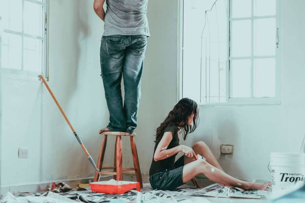
Venturing into paint selection can transform your home from a living space to a canvas that radiates your style.
Colors wield the power to evoke emotions, influence perception, and even manipulate the sense of space.
The interplay of varying hues against the canvas of your walls, when mediated by the caress of natural light and the luminescence of engineered fixtures, reveals a spectrum of potential ambiances.
A prudent choice in paint finish augments the beauty of your color choice and caters to the wear and demand of each unique room.
In this article, I’ll guide you through the nuances of color psychology, lighting influences, and the symphony of finishes to help you make informed decisions that sing in harmony with your home’s character.
Understanding the Psychology of Color in Room
Embarking on the adventure of selecting the perfect palette for your living spaces is more than a mere aesthetic choice; it’s a strategic decision that can influence mood and atmosphere.
From experience, I’ve learned that choosing calming colors for bedrooms and private retreats can transform them into sanctuaries of serenity—soft, muted tones or cool shades that whisper tranquility are the cornerstones of a restful haven.
Conversely, energizing hues can instill vibrancy and inspire activity in more dynamic home areas, such as the living room or kitchen.
Whether you’re craving the zest of a citrus yellow in the breakfast nook or the stimulating presence of a bold red in the dining room, color choices can invigorate or soothe the occupants, ultimately setting the tone for their daily experiences.
Choose Calming Colors for Bedrooms and Private Spaces
In the sacred stillness of bedrooms and personal alcoves, I advocate embracing tranquil hues that serve as a backdrop for rest and introspection. Gentle lavender, serene blues, or the faintest hint of sage — these colors nurture peace and promote soothing slumber. It’s a painterly approach to wellness, where the brush stroke is as tender as the lullaby sung by the walls themselves.
Opt for Energizing Hues in Living Areas and Kitchens
Imbuing the heart of the home, such as the kitchen and communal gathering spaces, with spirited colors can be transformative. Rich, bold hues like a confident teal or sun-drenched terra cotta add a dash of dynamism and foster an environment where warmth and creativity are abundant, propelling the spaces from simply functional to the epicenter of zestful living.
How Lighting Affects Your Paint Choices
The interplay between color and lighting is an often overlooked yet pivotal element in painting and interior design.
The interjection of daylight and artificial luminance can drastically alter the appearance of your chosen hues.
In my practice, I’ve observed how the same color can oscillate between vibrant and muted based on the sun’s position or the glow of a lamp.
Before choosing a shade for your room, it is imperative to examine the natural light sources and observe how their spectral dynamics interact with the paint selections.
I urge clients to live with their chosen samples throughout the day, scrutinizing them under the morning’s freshness, the afternoon’s blaze, and the evening’s softness to ensure the hue’s true nature is consistent with their vision for the space.
Assess Natural Light Sources Before Selecting Shades
Understanding the natural light in a space is integral to making informed paint selections; an oversight in this step could lead to unexpected results post-application. A color’s character can shift dramatically when basked in the bright midday sun or softened by the gentle glow of a Western sunset: a cool blue might become aloof or strikingly welcoming depending on the light’s embrace. Therefore, I always advise my clients to scrutinize potential shades under the full spectrum of their room’s natural lighting, guaranteeing compatibility from dawn until dusk.
Test Paint Samples at Different Times of Day to Ensure Consistency
A seasoned painter once shared with me a nugget of wisdom that I’ve carried through every project: to ensure the color you’ve fallen for doesn’t betray you when it covers your walls, observing your paint samples under the chameleon skies of different times is crucial. Viewing your potential palette during the golden hour of dawn, the zenith of noon, and the dusky embrace of twilight will safeguard against disparaging surprises once the color lives on your walls—a practice that can markedly determine the outcome of your interior design endeavors.
The Role of Paint Finishes in Your Color Selection
As I delve deeper into the nuances of home aesthetics, I recognize that color decisions extend beyond the hue itself; the chosen paint finish plays a pivotal role in achieving each room’s desired ambiance and functionality.
From the radiant glow of a gloss finish in a lively kitchen to the subtle sophistication of a matte coating in a tranquil bedroom, finishes must align with room utility.
In areas where the bustle of family activity is commonplace, I factor in the vibrancy of color and the practicality of surface cleaning.
A well-matched finish enhances visual appeal and preserves longevity and ease of maintenance, which homeowners sincerely appreciate.
Match Gloss Levels to the Function of Each Room
As I navigate the diverse needs of each space, selecting the appropriate gloss level becomes a task akin to tailoring a delicate garment; it must fit the room’s function perfectly. A satin finish, rich in its luster, can withstand the fingerprints and stains of a bustling family hall. In contrast, with its non-reflective poise, a flat finish cradles the walls of an adult’s study in understated elegance. Through thoughtful consideration, the finish not only aids in durability but also in defining the very character of each room.
Consider Durability and Ease of Cleaning in High-Traffic Areas
In high-traffic areas of the home, selecting paint with durability and ease of maintenance in mind is not merely a suggestion; it’s a necessity. These spaces endure frequent touch, impact, and the inevitable scuff: hallways that bear the flurry of daily comings and goings, bustling kitchens subject to culinary splatters, and children’s playrooms splashed with creativity. Hence, a higher-sheen paint or one specifically formulated for endurance can mean the difference between a wall that withstands the test of time and one that succumbs to the wear and tear of busy household life.
- Evaluate each room’s daily activity level to determine the paint finish’s appropriate toughness.
- Consider semi-gloss or gloss finishes for areas like kitchens and bathrooms that require frequent cleaning.
- Invest in scrubbable paints designed for high-traffic situations to keep walls looking fresh and vibrant, maintaining your home’s aesthetic appeal.
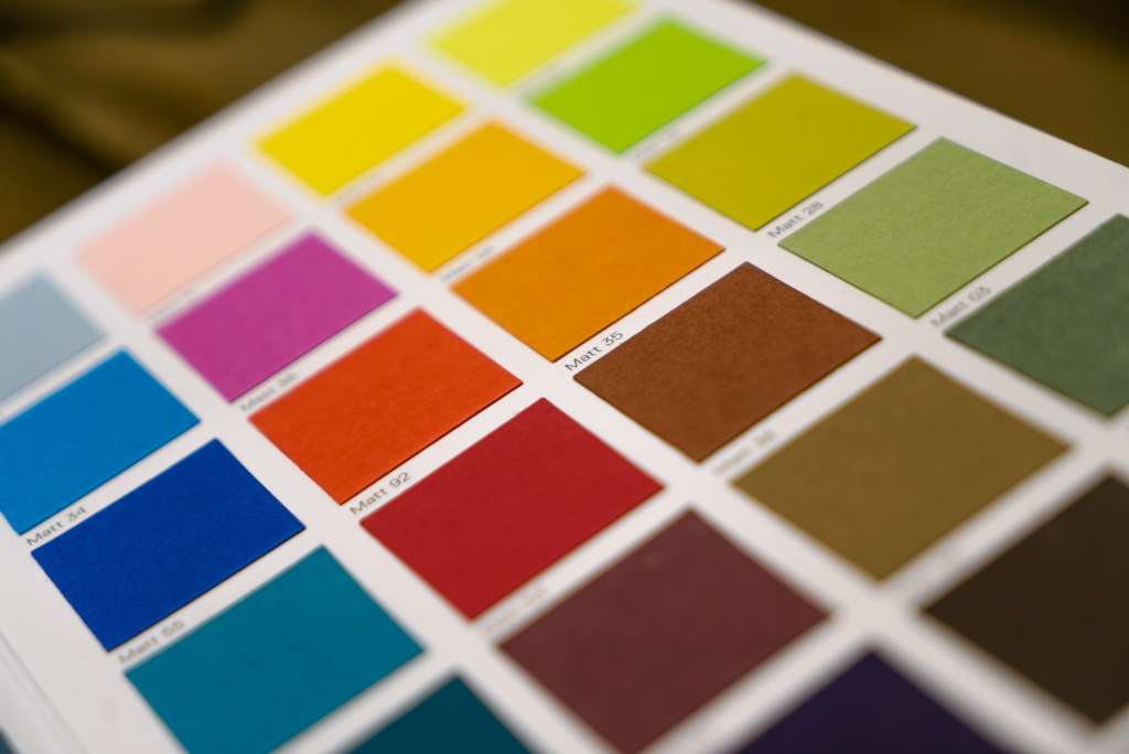
Coordinating Colors for a Cohesive Home Palette
Harmony is key in the symphony of interior design, and choosing the perfect color scheme is tantamount to conducting a visual orchestra in your home.
Drawing from the foundational principles of the color wheel, I have developed a keen eye for selecting shades that complement one another and foster a natural transition between spaces.
Beyond the walls of each individual room lies the potential to create a narrative through color, using a consistent accent color to weave a thread of continuity throughout the home.
Meticulously curated, this coordinated approach brings balance, enhancing the overall aesthetic while subtly guiding the mood from one area to the next.
Use Color Wheel Principles to Select Complementary Shades
Incorporating my years of expertise, I harness the color wheel—the artist’s compass—to pinpoint shades that sing in visual harmony for my client’s homes. Scouring the spectrum from analogous to complementary colors, I determine pairings that strike a perfect chord, ensuring each room flows seamlessly into the next. My client-centered consultations involve thoroughly exploring this tool, ensuring their taste is reflected in a balanced and unified color story throughout their sanctuary.
Connect Spaces With a Consistent Accent Color Throughout the Home
In my design ventures, I’ve discovered that threading a consistent accent color throughout your living spaces is a subtle yet potent technique to unify the home’s personality. By selecting a signature hue that appears in various forms—be it the plush throw in your living room, the delicate trim in your hallway, or the fabric of the cushions in your sunroom—you craft a narrative that ties each distinctive space together. This approach elevates the overall design and bridges the gap between each room’s uniqueness and the home’s collective identity.
Tips for Testing Paint Colors Before Commitment
Embarking on a painting project is an immersive process, peppered with decisions that will define the feeling of your home.
As you consider committing to a shade, it is critical to create a full-spectrum experience by applying large swatches directly to the walls.
This step is pivotal in understanding the intricacies of your chosen palette. It reveals subtle undertones that might be obscured in smaller samples.
It’s a practice that lays bare the true character of the paint, ensuring your selection resonates with the room’s ambiance in all lights and from every angle.
Apply Swatches on Large Sections of the Wall to View Undertones
In my years of selecting home colors, I’ve embraced a vital technique: applying generous wall swatches to scrutinize the undertones. these underlying hints can elevate a room from charming to captivating, but they’re elusive without a substantial preview. By covering a broad area, clients can witness how these subtle nuances play with the home’s unique lighting, ensuring the chosen paint reflects their vision perfectly.
Mastering paint selection is pivotal to crafting the ambiance and functionality of your home. Color psychology influences mood and activity in various spaces.
The interplay of light with paint hues is crucial, necessitating observation of samples throughout the day to ensure optimal consistency in all lighting conditions.
Paint finishes must align with room usage, balancing aesthetic appeal with practical durability for long-lasting results.
A cohesive palette, orchestrated using color wheel principles and an accent color narrative, combines each room’s distinctive character, breathing harmony into your living environment.
Mastering paint selection is crucial for achieving your space’s perfect aesthetic and atmosphere. By considering factors like lighting, room size, and purpose, you can make informed choices that enhance the beauty and functionality of your home. At 3S Painting, we provide expert guidance to help you choose the ideal colors, ensuring a stunning finish that reflects your style and complements your environment.
FAQ
How can the mood I want to create in a room influence my paint color choice?
The mood you envision for a space should be your compass when selecting paint colors. Soft blues and greens can evoke calm and serenity, while bold reds and yellows bring energy and warmth. Before picking a color, ask yourself: Do I want this room to feel relaxing, vibrant, cozy, or sophisticated? Let your answer guide your palette, as color psychology plays a powerful role in shaping how a space feels to everyone who enters it.
Why do paint colors look so different at home compared to the store?
Lighting is the secret culprit behind color transformations. Natural light, artificial light, and even the direction your windows face can dramatically alter how a color appears. A shade that seems perfect under store lights may look entirely different in your home. Always test paint samples on your walls and observe them at different times of day to see how the color truly behaves in your unique environment.
What’s the “three-color rule,” and how can it help me avoid color chaos?
The three-color rule is a designer’s secret for creating harmony: limit your palette to three main colors, often in a 60:30:10 ratio—60% dominant color (usually walls), 30% secondary color (furniture or curtains), and 10% accent color (decor or art). This approach ensures your space feels balanced and visually appealing, preventing the overwhelm that comes from using too many competing hues.
How do undertones in paint colors impact the final look, and how can I spot them?
Undertones are the subtle hints of color beneath the surface—think of a beige with a pink, yellow, or gray cast. These undertones can make a huge difference, especially when paired with your furniture and décor. To spot them, compare your chosen color to a true white or another neutral, and observe how it shifts. Testing the darkest color on a paint strip can also reveal undertones you might otherwise miss.
Is it better to choose paint colors before or after selecting furniture and décor?
Contrary to what many believe, it’s often wiser to pick your furniture and décor first. Paint is one of the easiest elements to change, while finding the perfect sofa or rug is much harder. By choosing your key pieces first, you can select a paint color that complements and enhances your overall design, ensuring a cohesive and intentional look throughout your space.

James Schrienk, a resident of Columbus, OH, is the proud owner of 3S Painting. With a wealth of experience in managing businesses of various scales, his expertise lies in project and people management. Jim thrives in team environments, always focusing on labor efficiency and delivering high-quality client results. His leadership style and practical communication skills have made him an exceptional manager and a driving force behind the success of 3S Painting. When he’s not leading his team to excellence, Jim enjoys continuously exploring innovative strategies to improve customer satisfaction.