How Interior Paint In Your Home Can Affect Your Mood
When updating your home’s interior, paint color does more than “look nice”—it helps set the emotional tone of each room. Color can subtly influence how relaxed, motivated, social, or focused you feel, which is why choosing shades based on how you want to live in the space is often more effective than picking only what’s trending.
The connection between color and mood
Color psychology explores how people commonly respond to different hues and how those responses can shape the experience of a space. While personal preference and lighting matter, certain colors are frequently associated with calmer, more energetic, or more grounded environments—making color planning a practical part of interior design, not just a decorative afterthought.
Room-by-room color ideas (with mood goals)
Bedroom: Peaceful and sleep-supporting
A bedroom usually works best when it feels quiet and restorative. Softer, cooler shades can help the room feel less “busy” and more relaxing at the end of the day.
Color directions to consider:
-
Powdery blues for a gentle, calming vibe.
-
Soft greens for balance and a natural, settled feel.
-
Light lavender or airy gray for a soothing, minimal look.
Pro tip: In low-light bedrooms, choose lighter tints (or warm off-whites) so the room stays cozy instead of dull.
Kitchen: Upbeat and welcoming
Kitchens are social, active spaces—often the place where everyone naturally gathers. Warmer hues can make the room feel lively and inviting, especially when paired with bright lighting.
Color directions to consider:
-
Warm yellows to keep the space feeling sunny and friendly.
-
Reds to add bold energy (best as accents, islands, or feature areas).
-
Terracotta or soft orange tones for warmth without harshness.
Pro tip: If you like bold colors but want a cleaner look, limit stronger tones to one wall or key architectural feature.
Home office: Clear, focused, distraction-free
A productive workspace benefits from colors that feel steady and clean rather than overly stimulating. Neutrals and softer cool tones can create a background that supports concentration and consistency.
Color directions to consider:
-
Light beige, greige, or soft gray for a calm base.
-
Muted blue or green to keep the space grounded.
Try to avoid: Highly saturated colors everywhere—they can feel visually loud during long work sessions.
Living room: Comfortable and easy to spend time in
Living rooms often need to feel both relaxing and guest-friendly. Warm neutrals and natural tones can make the space feel inviting without overpowering furniture, art, or décor.
Color directions to consider:
-
Creamy neutrals and warm gray for an open, welcoming feel.
-
Earth tones like warm brown or deeper green for comfort and depth.
Pro tip: If walls are neutral, bring warmth through texture—wood tones, layered fabrics, and rugs help the room feel intentional.
Bathroom: Fresh, clean, spa-like
Bathrooms often feel best when they’re light, clean, and calming. Softer cool colors and gentle neutrals can create a “reset” feeling—especially when paired with simple finishes.
Color directions to consider:
-
Soft blue-green tones for a spa-inspired look.
-
White, ivory, and light beige for a crisp, clean style.
Pro tip: Choose a moisture-appropriate finish (often satin or semi-gloss) to help with durability and cleaning.
Children’s rooms: Fun, creative, and adaptable
Kids’ spaces are a great place for personality, but the best results usually come from balancing playful color with areas that still feel restful.
Color directions to consider:
-
Bright primary accents for creativity and play.
-
Pastels for a softer, calmer mood.
-
Patterns or murals as a feature—without saturating the entire room.
Pro tip: Keep the main wall color flexible and add bold color through décor so the room can evolve as your child grows.
Dining room: Rich, dramatic, and elevated
Dining rooms are ideal for deeper tones that feel intentional and “special.” Darker hues can add elegance and make gatherings feel more intimate and memorable.
Color directions to consider:
-
Emerald-inspired greens for a classic, refined look.
-
Deep navy, charcoal, or smoky gray for a modern, upscale feel.
Pro tip: Dark walls look best with good lighting—consider warmer bulbs or a statement fixture to keep it inviting.
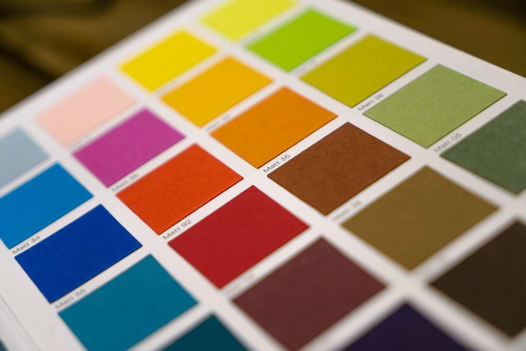
How to choose the right color
Paint can look completely different depending on lighting, time of day, and surrounding materials. Testing before committing usually saves time and prevents costly repaints.
-
Paint sample swatches on at least two walls and check them morning, afternoon, and evening.
-
Choose the mood first (calm, energetic, cozy, focused), then narrow to shades.
-
Use bold colors strategically—balance them with neutrals to avoid visual overload.
Have you chosen the perfect color, and you’re ready to change the mood in that special room in your house? Call us today for a free estimate.
FAQs
Why do warm colors feel cozy, while cool colors can feel more serious?
Warm shades (like reds, oranges, and warm yellows) tend to read as inviting because they visually “advance” and make spaces feel more lively and intimate. Cooler shades (like blues, blue-grays, and some greens) often feel calmer or more reserved, especially in lower light or when the color is highly muted.
What are the safest paint colors if you want something flexible?
If long-term versatility is the priority, stick to soft neutrals—warm whites, light greige, pale beige, and gentle gray tones—because they pair easily with changing décor and usually don’t dominate a room. Sampling matters, since undertones can shift based on flooring, trim, and sunlight.
Which colors are commonly used to create a calmer bedroom?
Light, softened tones are popular for sleep-focused spaces—think airy blues, muted greens, soft lavender, and low-contrast grays. These shades typically support a quieter, more restful bedroom feel than high-saturation colors.
Can dark or bold paint colors still feel positive (not gloomy)?
Yes—deep colors can feel dramatic, cozy, and upscale when balanced with good lighting and lighter elements (trim, ceilings, furnishings, or artwork). Using a darker shade on one wall (or in a dining room, study, or powder room) can create impact without making the whole space feel heavy.

James Schrienk, a resident of Columbus, OH, is the proud owner of 3S Painting. With a wealth of experience in managing businesses of various scales, his expertise lies in project and people management. Jim thrives in team environments, always focusing on labor efficiency and delivering high-quality client results. His leadership style and practical communication skills have made him an exceptional manager and a driving force behind the success of 3S Painting. When he’s not leading his team to excellence, Jim enjoys continuously exploring innovative strategies to improve customer satisfaction.