Color decisions are rarely “just aesthetic”—they influence mood, behavior, and how large, bright, or comfortable a space feels. In Columbus, color choices show up everywhere: updated historic homes, modern condos, retail buildouts, restaurants, offices, and outdoor living areas that blend indoor comfort with Midwest-friendly practicality.
This guide explains how color psychology works, how Columbus designers and homeowners use it today, and how to choose paint colors that make sense for real spaces (lighting, finishes, and durability included).
How color psychology shapes spaces
Color psychology describes common emotional and behavioral responses people associate with different colors. While results can vary by person and culture, designers often use these patterns to support a room’s purpose—rest, focus, socializing, or brand recognition.
Quick guide: what colors tend to communicate
Use this table to match the “job” of the room to the type of palette that typically supports it.
| Color family | Often associated with | Great for | Pro tip (so it doesn’t backfire) |
|---|---|---|---|
| Blues | Calm, serenity, focus | Bedrooms, bathrooms, offices | Balance with warm woods/brass so it doesn’t feel cold. |
| Greens | Nature, renewal, concentration | Living rooms, offices, waiting areas | Choose muted/sage for “grown-up calm,” not neon. |
| Reds | Energy; can stimulate appetite | Dining rooms, accent walls, front doors | Use in smaller doses to avoid overstimulation. |
| Yellows/oranges | Warmth, sociability, energy | Kitchens, family rooms, creative spaces | Pick softer or earthier versions for long-term livability. |
| Warm neutrals/earth tones | Comfort, grounded “home” feeling | Whole-home palettes, open layouts | Layer with 2–3 sheens/textures for depth (walls, trim, accents). |
Columbus design trends
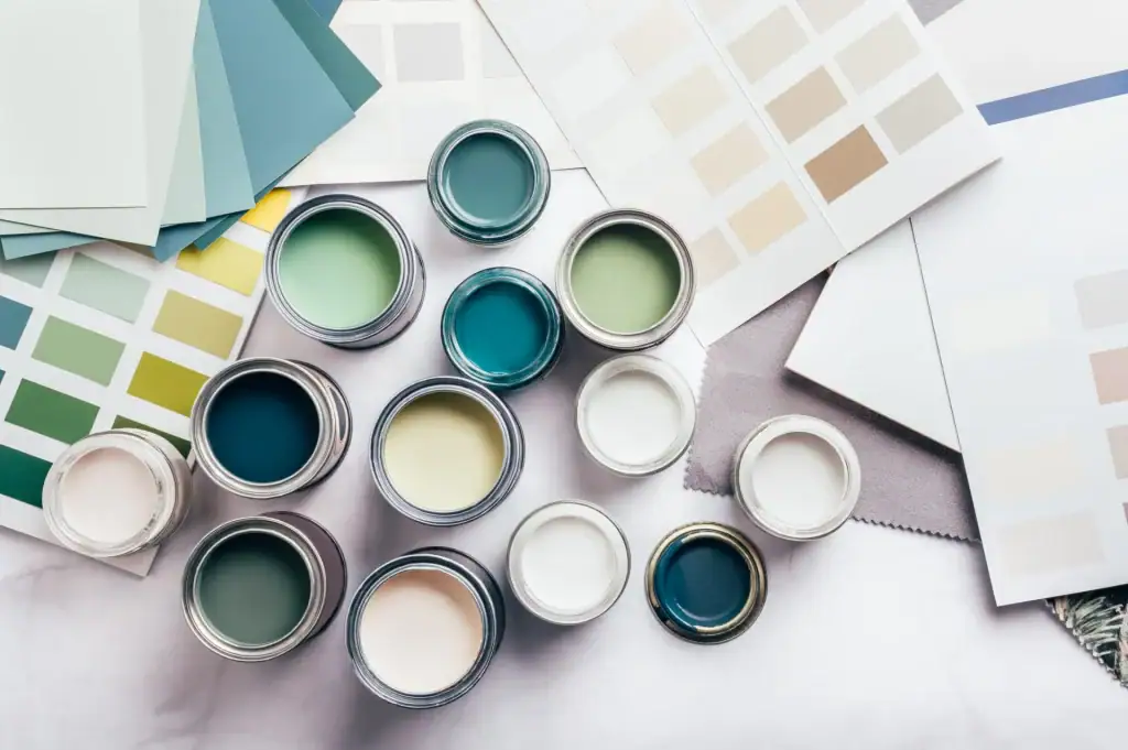
Columbus interiors are leaning into nature-inspired palettes and warmer neutrals—think terracotta, sage, warm browns, and other earthy tones that feel cozy and grounded. At the same time, many homeowners still want personality, so bold accents (deep teal/cobalt/mustard-style pops) often show up on a statement wall, built-ins, or powder rooms rather than across an entire floor plan.
For outdoor living spaces, color trends typically favor natural, landscape-friendly hues that pair well with wood, stone, brick, and black/bronze hardware. That’s especially useful in Columbus where patios, decks, and three-season spaces need to look intentional across spring, humid summers, and gray winter light.
Then vs. now: how color choices evolve
Color trends change because lifestyles change—open concept layouts, hybrid work, and modern lighting all influence what “works” in a home or commercial space. Today’s approach in Columbus is less about one “perfect” color and more about building a palette system: main wall color, trim color, accent color, and a repeatable metal/wood tone.
Instead of repainting every few years due to trend whiplash, many Columbus projects now use timeless base colors with easy-to-update accents (pillows, rugs, art, and a single repaintable feature area). This keeps spaces current without locking you into a bold choice everywhere.

How to pick the right hues
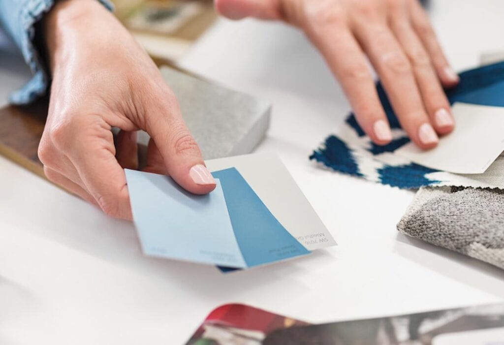
Most color mistakes happen because paint is chosen in isolation—without accounting for light, floors, countertops, and fixed finishes. Use this simple process to reduce risk and choose confidently.
Step-by-step color selection
-
Identify the goal of the room (calm, social, productive, premium, playful).
-
Check lighting (north-facing often reads cooler; warm bulbs shift paint warmer).
-
Match undertones to what can’t change (flooring, tile, cabinets, brick).
-
Sample correctly: test large swatches on multiple walls and view morning/day/night.
-
Choose finish on purpose (bathrooms need moisture-friendly finishes; trim needs durability).
Health-conscious options (low-VOC paint)
For many Columbus interior projects—especially bedrooms, nurseries, and occupied homes—low-VOC or no-VOC paints are popular because they reduce volatile organic compounds compared to conventional paint. Low-VOC is generally described as paint formulated to release less VOC off-gassing than traditional options, which can help support better indoor air quality during and after painting.
If you’re tinting paint, remember VOC levels can vary by product line and colorant system, so it’s smart to confirm the exact product being used.

Where professional painting services help most
Color psychology works best when the finish looks consistent, the edges are clean, and the sheen is correct—because sloppy application changes how the color reads. A Columbus painting professional can also help you avoid common issues like undertone mismatch, patchy coverage, and sheen flashing in bright light.
If you want a palette that looks intentional across connected rooms (and still feels “you”), pairing a color consultation with a pro paint plan usually saves time, money, and repaint regret.
 Columbus, Ohio