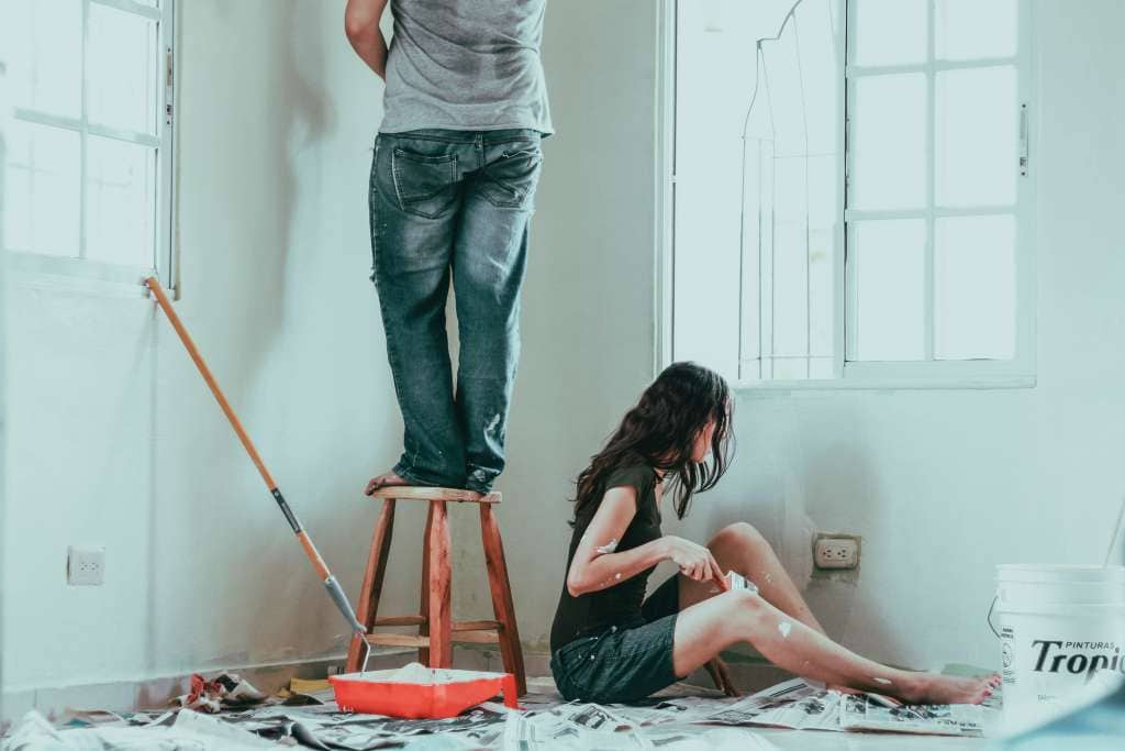
Choosing double-wide mobile home exterior paint colors isn’t just about picking a pretty swatch. The right palette can make your home feel larger, balance proportions, cool heat-soaked walls, and boost curb appeal for years to come. This guide walks you through style, light, materials, and maintenance—so your color decision looks great on day one and still makes you smile down the road.
Start with the Fixed Features You Can’t (or Won’t) Change
Every great exterior palette begins by matching colors to the elements that are staying:
- Roof color: Shingles or metal roofing anchor the scheme. Charcoal, weathered wood, or light gray roofs each lean toward certain palettes.
- Windows and doors: Factory finishes (white, almond, bronze) inform your trim and accent choices.
- Skirting/underpinning: Vinyl, stone veneer, or painted plywood has undertones you’ll want to harmonize with.
- Decks and steps: Stained wood or composite colors can clash or complement; plan for them.
Photograph each elevation in daylight and note these tones. Your “keepers” are the baseline for the rest of the scheme.
Understand How Form & Proportions Affect Color
Double-wides have long, low profiles. Color placement can change how that reads from the street:
- Light body + darker skirting: Makes the home feel taller and more grounded.
- Two-tone body: A mid-tone body with a slightly darker lower band visually shortens the body.
- Crisp trim: A lighter trim around windows and corners sharpens lines and frames views.
- Accent restraint: One confident accent (front door or shutters) beats several competing accents.
Think of the shell (siding), the frame (trim), and the punctuation (door/shutters). If each has a job, the exterior feels intentional.
Consider Sun, Shade, and Heat
Exposure changes color. South- and west-facing sides are warmer and brighter; north-facing sides are cooler and muted in color.
- Sun-blasted walls: Mid-tones hold up better than super-dark shades, which can fade faster and increase heat gain.
- Shady sides: Colors appear cooler and darker; go a touch lighter than you think.
- High-gloss on doors and metal: Looks sharp but shows flaws. Semi-gloss often hits the sweet spot.
When in doubt, step back to a mid-tone body color and let your trim and door bring contrast.
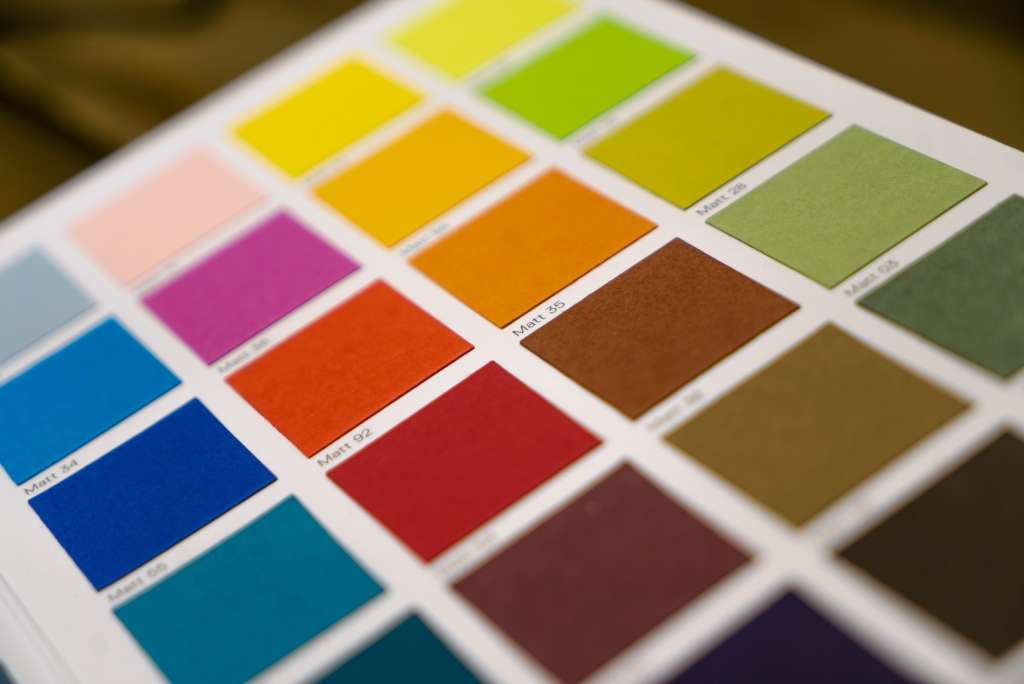
Read Undertones the Easy Way
Gray isn’t just gray; it leans blue, green, or violet. Beige can skew pink, yellow, or gray. To find undertones:
- Lay 3–5 samples side by side against your skirting or roof.
- The odd one out reveals undertones in the others.
- Keep the undertone that complements—never fights—your fixed features.
Matching undertones is the simplest way to make budget-friendly materials look upscale.
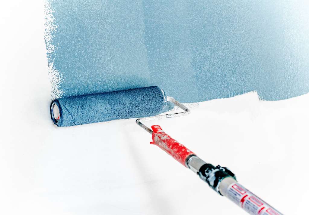
Sample Big, Sample on Every Side
A color that looks perfect indoors can look totally different outside. Test like a pro:
- Paint at least 18×24 in. swatches on foam boards or on the actual siding.
- Place swatches on each elevation, both sunny and shaded.
- Check morning, noon, and evening; review from 20–30 feet away.
- If your siding has texture or ribbing, brush both with and across the grain to ensure real coverage.
A few extra sample quarts cost less than repainting a whole wall.
Palette Playbook: Five Fail-Safe Schemes for Double-Wides
Use these as springboards. Swap body/trim/accent as you like, but keep contrast purposeful.
1) Soft Greige + Clean White + Navy Door
- Body: Warm greige that pairs with tan or gray roofs
- Trim: Crisp white around windows and corners
- Accent: Deep navy door or shutters for a classic pop
Why it works: Greige unifies mixed materials; white sharpens edges; navy adds personality without shouting.
2) Coastal Cool Gray + Warm White + Teal Door
- Body: Cool gray to offset warm sunlight
- Trim: Cream-leaning white to soften the contrast
- Accent: Muted teal for the door
Why it works: Gentle contrast keeps a longer façade calm; teal nods coastal without looking theme-y.
3) Earthy Sage + Putty Trim + Brick-Friendly Red Door
- Body: Desaturated sage that plays well with stone or brick skirting
- Trim: Putty or warm gray
- Accent: Brick red door
Why it works: Natural tones feel grounded and reduce visual length on wider homes.
4) Modern Charcoal + Warm Cedar Stain + Soft White Trim
- Body: Charcoal or iron gray on smooth siding
- Trim: Soft white to frame lines
- Accent: Wood-look porch posts or cedar-tone door
Why it works: High contrast and warm wood keep a dark body from feeling severe.
5) Creamy Off-White + Greige Trim + Black Door
- Body: Cream with a touch of warmth
- Trim: Greige to add dimension and disguise dust
- Accent: Black or near-black door
Why it works: Bright without being stark; feels clean and airy, especially with broad porches.
Color Placement Tips That Punch Above Their Weight
- Break the body with a skirt band: A subtle, darker band above the skirt gives a tailored look.
- Frame the ends: A slightly darker color on the short ends can visually shorten a long façade.
- Repeat the accent: Door color can reappear on shutters, mailbox, or light fixture bases for cohesion.
- Mind the reveal: Corner boards painted the trim color make edges look straight and true.
Working with Different Siding Materials
Double-wides can be finished with vinyl, aluminum, fiber cement, T1-11, or smooth metal panels. Matching color is only half the story—finish matters too.
- Vinyl: Choose lighter to mid-tone colors to reduce heat load; verify the paint and color are suitable for vinyl.
- Aluminum: Clean thoroughly, address chalking, and use a compatible primer before topcoats.
- T1-11 / wood: Prime cut edges and end grain; mid-tones help hide texture variations.
- Fiber-cement: Smooth substrates can carry darker colors gracefully; crisp trim really shines here.
- Metal skirting: Keep it darker or match it to the deck color to ground the home.
Trim and Accent Rules You’ll Actually Use
- Trim width: Slightly wider corner boards and window trim add “architecture” where none exists.
- Gutter color: Match gutters to trim if you want them to disappear, or to the roof if you want a seamless top line.
- Door sheen: Semi-gloss stands up to hand washing and weathering and contrasts with matte or satin siding.
Make a Small Home Feel Bigger (or Cozier) with Color
- To feel larger: Light, warm bodies with light trim; minimal high-contrast lines.
- To feel cozier: Mid-tone bodies with noticeable trim contrast; a bold door for interest.
- To shorten a long wall: Break the plane with a porch color change, vertical trellis, or darker end walls.
Keep Up the Fresh Look: Maintenance and Touch-Ups
Even the best palette needs care:
- Gentle annual wash: Low-pressure rinse with mild soap to remove dirt and pollen.
- Trim check: Caulk around windows, doors, and corner boards; touch up small chips before they grow.
- Door refresh: High-touch areas like doors may need a quick scuff-sand and new coat every couple of years.
- Skirting scan: Repaint or replace worn panels to keep your palette cohesive.
Budget-Smart Ways to Stretch Impact
- Repaint the door + trim first: A color change there can buy you a season or two before tackling the full body.
- Accent only one elevation: If the back or porch is your main view, prioritize that side.
- Use one great color + clean lines: A tidy single-color body with sharp trim beats a fussy tri-color done poorly.
Common Color Mistakes (and How to Avoid Them)
- Going too dark on sun-exposed vinyl: Can warp or overheat; stick to approved ranges.
- Ignoring undertones: A beige body paired with pink-leaning trim equals a permanent clash.
- Too many accents: Limit yourself—body, trim, one accent.
- Skipping big samples: Handheld fan decks mislead; you need wall-scale tests.
- Forgetting the neighborhood: Aim for standout, not a sore thumb. Your future self will thank you.
Ready-Made Mini Palettes to Try
These compact sets take the guesswork out of pairing. Use the first for siding/body, the second for trim, and the third for the door or shutters.
- Warmed Neutrals: Soft almond / clean white / bronzed black
- Subtle Cool: Mist gray/ivory white / slate blue
- Nature-Friendly: Sage green / putty/brick red
- Modern Classic: Greige / bright white / navy
- High Contrast: Cream/taupe trim / black door
Test each set on your actual elevations and adjust one step darker or lighter as your light dictates.
When to Call in a Pro
If your exterior features mixed substrates, heavy sun exposure, or complex color transitions at the skirting and porch, a seasoned team can help. For ideas and guidance tailored to mobile and manufactured homes, explore exterior paint color ideas for mobile homes—you’ll find color inspiration and planning tips that suit the unique proportions of double-wides. Use that resource as a springboard, then finalize your palette with large samples at home.
Step-by-Step: Your Double-Wide Color Decision Roadmap
- List the elements that stay (roof, windows, skirting, deck).
- Decide the mood (airy, modern, earthy, coastal, classic).
- Pick a body range (light, mid, or dark) based on exposure and material.
- Choose a trim that either blends softly or outlines with contrast.
- Pick one accent (door or shutters).
- Sample at full brightness on each elevation, then review in all lighting conditions.
- Lock the palette and plan the work order (door/trim/body or body/trim/door).
- Create a small touch-up kit for future dings.
FAQs
1) What color makes a double-wide look larger?
Light, warm body colors with light trim reflect more light and visually expand surfaces. Keep accents minimal and focused on the front door.
2) Can I paint vinyl siding on a mobile home a darker color?
Stick with lighter to mid-tone shades approved for vinyl. Extremely dark colors can absorb excess heat and may not be suitable for some siding types.
3) How do I match paint to brown or tan shingles?
Greige, warm gray, or earthy sage bodies pair well. Use cream or putty trim and a saturated door color for interest.
4) Should shutters match the door?
They don’t have to, but repeating the door color on shutters creates instant cohesion—especially helpful on long façades.
5) How many colors should I use?
Three is a safe target: body, trim, and one accent. Add a fourth only if you have a clear reason (e.g., special porch or skirting treatment).

James Schrienk, a resident of Columbus, OH, is the proud owner of 3S Painting. With a wealth of experience in managing businesses of various scales, his expertise lies in project and people management. Jim thrives in team environments, always focusing on labor efficiency and delivering high-quality client results. His leadership style and practical communication skills have made him an exceptional manager and a driving force behind the success of 3S Painting. When he’s not leading his team to excellence, Jim enjoys continuously exploring innovative strategies to improve customer satisfaction.