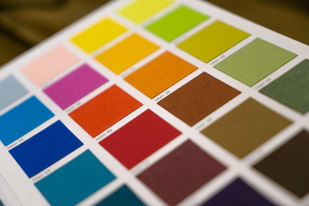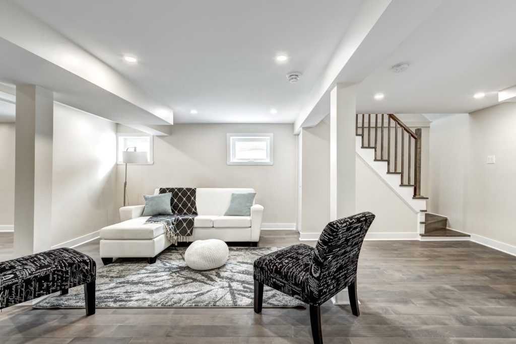
Columbus homes face low-light days, so selecting wall colors that influence mood and brightness is key. Here are winter-friendly color strategies, room-specific picks, and pro tips from 3S Painting to make your spaces warmer and more inviting from January to January.
Why Central Ohio Homes Need “Light-Smart” Colors
Short days and cloud cover flatten color. Paint with the right undertones can counter that. In Columbus, north-facing rooms read cooler; east light looks fresh but brief; west light turns golden (and sometimes harsh); and south light is the most forgiving. The goal: choose hues with a touch of warmth and a Light Reflectance Value (LRV) that won’t look chalky in summer or dingy in winter.
Quick guide:
- Cool light (north/east): lean, warm, and mid-light (LRV 55–70).
- Warm light (south/west): balanced neutrals or softened cools (LRV 45–65).
- Low-light interiors: cream-based whites or complex greiges to avoid a sterile feel.
The pro move: Test swatches on two walls in the same room—one with direct light and one without-to see how colors look at different times of day, giving you peace of mind in your choice.
The Columbus-Proof Neutral Stack (Your Year-Round Base)
These categories keep rooms bright without feeling stark. Exact brand names may vary, but the undertone and depth matter.
1) Cream-Forward Whites
- Undertone: soft yellow or vanilla, never neon.
- Best for: hallways, trim, and small rooms that feel flat in winter.
- Why it works: lifts light while adding quiet warmth so spaces don’t read blue.
2) Balanced Greige (Warm Gray + Beige)
- Undertone: taupe, mushroom, or putty—no green flash.
- Best for: open-concept spaces; it carries across changing light.
- Why it works: feels polished in summer, cozy in winter.
3) Mushroom & Stone Neutrals
- Undertone: brown-violet or brown-gray.
- Best for: living rooms and bedrooms where you want softness without beige.
- Why it works: depth hides scuffs and makes white trim pop.
4) Desaturated Sage & Olive Neutrals
- Undertone: gray-green with a hint of yellow.
- Best for: kitchens, offices, and dens; pairs well with wood and black accents.
- Why it works: brings an organic feel on gray days without going dark.
Room-By-Room Color Playbook
Living Room: Warm Welcome, Not Yellow Chaos
Aim for a cream-based white or a layered greige that doesn’t shift green. If your living room faces north, pick a hue a half-step warmer than you think you need. Add depth to built-ins or the fireplace surround with a mushroom or soft olive for subtle contrast.
Styling tip: Use satin on built-ins to bounce light; keep walls in eggshell for a soft glow.
Kitchen: Bright, Clean, and Not Sterile
Cool whites can feel icy in winter. Choose a neutral-to-warm white for walls and a muted green-gray or soft putty for islands or lower cabinets. Stainless, warm woods, and matte black hardware love this pairing.
If you’re considering a full room refresh, our interior painting team can help you test undertones under your actual lighting before anything goes on the wall.
Bedrooms: Calm Neutrals with Cozy Undertones
Go for mushroom taupe, powdered mauve-taupe, or dusty blue-green with a gray base. These read soothing at night and not too cold at dawn. Keep trim and creamy off-white so the room feels wrapped rather than high-contrast.
Finish tip: Matte or flat for adult bedrooms (with washable tech if possible); eggshell for kids’ rooms.
Bathrooms: Spa Light Without the Glare
Small rooms amplify undertones. Try a warm white, pearl gray, or misty green-gray. If tile and countertops lean cool, let the walls add warmth so skin tones don’t look sallow in the mirror.
Home Office: Focused but Friendly
Soft sage, muted eucalyptus, or stone gray encourages focus while staying comfortable on long video calls. If the room faces west, avoid colors that go neon at sunset—pick something with a gray base.
Accent Walls That Actually Help in Winter
Accent walls are most useful when they:
- Add depth behind a TV, fireplace, or bed.
- Balance a long, bright space that feels washed out.
- Tie in cabinet or furniture tones for harmony.
Pick a shade two to three steps darker than your main wall color with the same undertone family (e.g., greige main + deeper mushroom accent). This prevents clashing on dim days.
Trim, Ceilings, and Doors: The Silent Brighteners
- Trim: Choose a cream-based white a notch brighter than your walls. It frames views and makes wall color feel intentional.
- Ceilings: Slightly warm off-white. True white can look gray under winter light.
- Interior doors: Deep charcoal, ink blue, or soft black add architecture without darkening the whole room.
Finish & Sheen Guide for Columbus Light
- Matte/Flat (walls): hides texture, looks luxe, ideal for bedrooms and formal spaces.
- Eggshell (walls): great for living areas; wipes clean without glare.
- Satin/Semi-Gloss (trim/doors): durable and light-reflecting—gives that crisp outline you notice even on cloudy days.
Sample-Like-a-Pro (So You Don’t Regret a Gallon)
- Shortlist 3–5 colors per room across a narrow undertone family.
- Paint 12″ swatches on at least two walls; label them.
- Check at 8 am, noon, and 5 pm.
- If a color “grays out,” nudge one step warmer or one step lighter.
- Only after the wall test: order paint.
Want help narrowing shades? 3S Painting can bring curated boards and brush-outs, then tune selections on-site.
Color Combos We Love for Columbus Homes
Warm + Airy Open Concept
- Walls: cream-forward white
- Accent/built-ins: mushroom taupe
- Trim/doors: softened white + soft black on doors
- Metals: matte black, aged brass
Cozy Modern Living Room
- Walls: balanced greige
- Accent: olive-gray behind the sofa
- Trim: creamy off-white
- Textiles: flax linen, nubby wool, pale terracotta
Fresh Kitchen Update
- Walls: warm white
- Island/lowers: muted eucalyptus
- Uppers/trim: off-white
- Stone: light veined quartz or honed granite
Serene Bedroom Suite
- Walls: dusty blue-green
- Accent: deeper eucalyptus at the headboard
- Trim/ceiling: soft white
- Hardware: brushed bronze or black
Small-Space Tricks for Gloomy Days
- Raise the ceiling (visually): keep ceilings a touch lighter than walls.
- Erase shadows: continue the wall color over the crown or keep the crown close in tone.
- Bounce light: satin on built-ins and mirrors opposite windows.
- Keep depth: if everything is pale, add a mid-tone on a door or bookcase.
When to Go Dark (Yes, Even in Winter)
Dark colors can feel rich, not bleak, if you control the sheen and trim:
- Use matte on walls for a velvety look.
- Sharpen edges with semi-gloss cream trim.
- Add warm bulbs (2700–3000K) and layered lamps.
- Anchor with natural textures—oak, wool, leather.
Powder rooms, dining rooms, or a media den are great places to try this without overwhelming the rest of the home.
How 3S Painting Makes Color Decisions Easy
- On-site testing: We place swatches where your light is toughest.
- Undertone coaching: We flag greens that flash, beiges that go pink, and whites that turn icy.
- Finish planning: We match the sheen to traffic and texture so colors read correctly.
- Clean lines & coverage: Smooth walls and sharp trim make colors look intentional, not accidental.
Ready to talk timelines and samples? Our interior painting team serves Columbus homeowners with color-first planning and quality finishes.
FAQs
1) What interior colors make a Columbus home feel brighter in winter?
Cream-based whites, balanced greiges, and light mushroom tones reflect available light without going stark. They also stay inviting on gray days.
2) How do I pick a white that won’t look cold?
Choose an off-white with a soft yellow or vanilla undertone and test it in morning and evening light. If it looks bluish at night, step up the warmth.
3) Will green look too cold in winter?
Not if it’s softened. Sage and olive with a gray or beige base feel organic and cozy, especially paired with warm wood and cream trim.
4) What sheen should I use for busy areas?
Eggshell balances cleanability and low glare for living spaces; satin or semi-gloss is best for trim and doors.
5) Can you help me test colors before I buy paint?
Yes—3S Painting can bring curated swatches, paint sample boards, and test patches on your walls so you can see true color under your lighting.

James Schrienk, a resident of Columbus, OH, is the proud owner of 3S Painting. With a wealth of experience in managing businesses of various scales, his expertise lies in project and people management. Jim thrives in team environments, always focusing on labor efficiency and delivering high-quality client results. His leadership style and practical communication skills have made him an exceptional manager and a driving force behind the success of 3S Painting. When he’s not leading his team to excellence, Jim enjoys continuously exploring innovative strategies to improve customer satisfaction.