How To Avoid Bold Interior Color Mistakes | 3S Painting
Bold paint can make a room feel custom and high-end, but it can also go sideways quickly when lighting, undertones, or surrounding finishes aren’t considered. The key is to plan your palette, test correctly, and use bold color with intention—not impulse.
Why Bold Paint Choices Often Disappoint
Most “color regret” happens because paint behaves differently on a full wall than it does on a tiny chip. Once a bold shade is surrounded by your flooring, trim, furniture, and lighting, hidden undertones can appear and the room can suddenly feel darker or busier than expected.
Common reasons bold colors miss the mark:
-
The shade looks great in daylight but turns heavy at night.
-
Undertones show up only after the whole wall is painted.
-
The color competes with fixed finishes like floors, counters, tile, or cabinets.
Step 1: Decide the “Job” of the Color
Before picking a paint name, pick a purpose. Bold color works best when it has a clear role—like adding drama, warming up a large room, creating a focal point, or modernizing a dated space.
Ask these questions first:
-
Should this room feel relaxed, cozy, bright, or moody?
-
Is the bold color the main event, or a supporting accent?
-
What must the paint coordinate with (sofa, rug, floors, cabinets, tile)?
Step 2: Use Bold Color Where It Makes Sense
If the goal is impact without overwhelm, limit bold paint to one “anchor” area rather than coating every wall. Great candidates include the wall behind the bed, the fireplace wall, a dining room feature wall, or a built-in/bookcase area.
Placement tips that keep rooms feeling balanced:
-
Choose a wall you naturally look toward when entering the room.
-
Avoid putting the darkest color on the wall with the least natural light.
Step 3: Keep the Palette Simple
Bold works best when the room has a clear structure. A practical approach is to build the room using three layers:
-
Primary backdrop: the neutral or softer tone that keeps the space open.
-
Secondary support: trim color, adjacent walls, or major furniture tones.
-
Statement color: the bold shade used in a controlled amount.
This keeps the look intentional and prevents the “everything is fighting everything” effect.
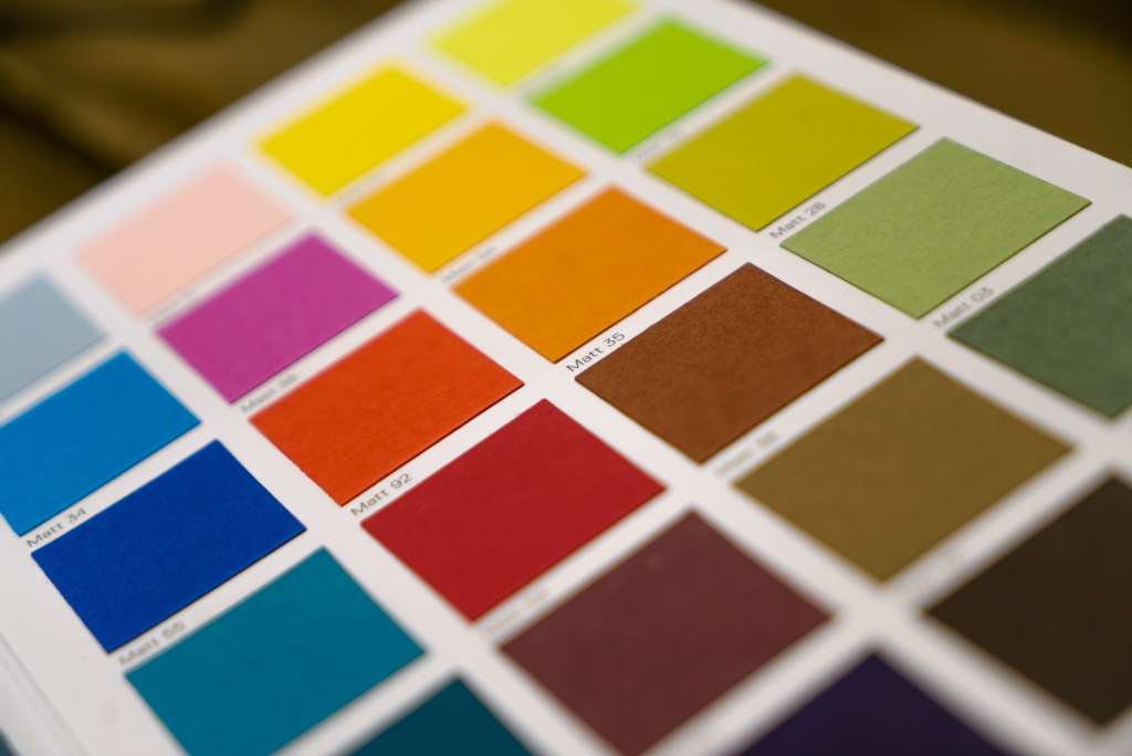
Step 4: Test Like a Pro (Not Just a Swatch)
A chip from the store is only a starting point. To see what paint will really do, sample it on your actual walls so you can evaluate it next to your finishes and in your lighting.
A smarter testing routine:
-
Paint 2–3 sample blocks large enough to read clearly from across the room.
-
Test on multiple walls to catch shadows and changing light.
-
Check it in the morning, afternoon, and evening.
-
Look at it beside flooring, trim, and any décor you plan to keep.
Step 5: Let Lighting Make the Final Call
Light changes color—sometimes dramatically. A bold shade can look crisp in bright daylight, then turn muted, warmer, or much darker under indoor bulbs.
Quick lighting realities to plan around:
-
Cooler natural light can make colors feel sharper or more muted.
-
Warm bulbs can intensify warm colors and shift neutrals.
-
Low light can make deep shades feel heavier and visually shrink the room.
Step 6: Match the Paint to the “Fixed” Finishes
Walls aren’t the only surfaces in the room—floors, ceilings, and trim frame the color and affect how bold it feels. The more permanent the surface (like flooring or countertops), the more your paint should respect it.
Before choosing the final shade:
-
Compare paint options to your floor undertone (warm wood, gray LVP, beige tile).
-
Decide if trim should pop (contrast) or blend (softer transition).
-
Keep ceilings lighter when walls are intense to preserve openness.
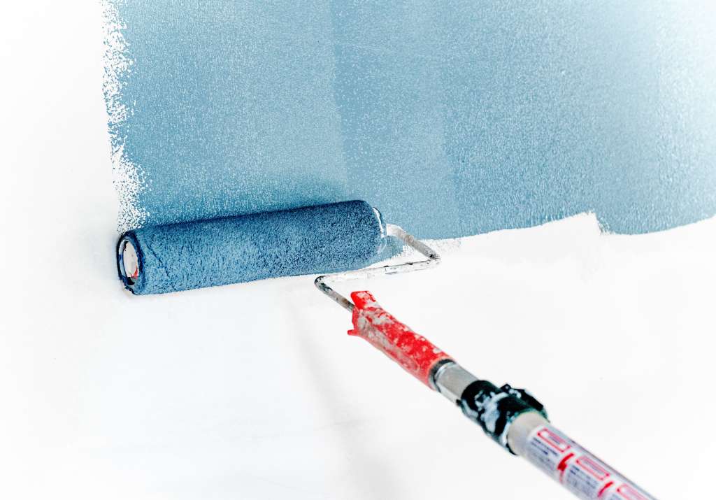
Step 7: Pick the Right Sheen for Bold Colors
Bold color + too much shine can exaggerate wall flaws and make the finish feel harsh. Many bold interiors look best with lower-sheen options, adjusted by how much durability the room needs.
General guidance:
-
Bedrooms and living rooms: matte/low-sheen for a softer look.
-
Hallways and kids’ areas: a more cleanable finish can be practical.
When It’s Worth Hiring a Painter
If you’re stuck between shades, worried about undertones, or trying to make bold color look clean and premium (not streaky or patchy), professional help can prevent expensive do-overs. Prep work and crisp cut-ins matter even more when the color is dark or saturated.
For Columbus-area interior painting and bold color projects, 3S Painting can help with planning, prep, and a finish that looks intentional.
FAQ
How should bold paint colors be tested before painting the whole wall?
Start with a few chip cards to narrow your options, then paint large test patches (not tiny squares) directly on the wall.
Check each sample in daylight, lamplight, and evening conditions, and view it next to the items that aren’t changing—floors, cabinets, and large furniture.
What should be considered when combining a bold accent wall with other wall colors?
A strong accent color can shift how nearby neutrals look, so select surrounding colors that share a compatible undertone and don’t turn dull beside the accent.
If the room starts to feel visually noisy, simplify the palette by keeping the remaining walls and textiles calmer so the accent wall stays the clear focal point.
Why can a bold color look different once it dries?
As paint cures, its finish and color depth settle, and lighting can reveal undertones that weren’t obvious when the paint was wet or when you only saw a small swatch.
That’s why it’s important to judge the color after it fully dries and in the same lighting you use daily.
How can bold wall colors work in a room with dark floors and/or a darker ceiling?
Use contrast strategically—lighter trim, a brighter ceiling, or lighter adjacent walls can keep the space from feeling tight while still letting bold color shine.
If the room lacks natural light, choose a bold shade that has clarity (not too muddy) and test it next to the flooring to avoid an overly heavy look.

James Schrienk, a resident of Columbus, OH, is the proud owner of 3S Painting. With a wealth of experience in managing businesses of various scales, his expertise lies in project and people management. Jim thrives in team environments, always focusing on labor efficiency and delivering high-quality client results. His leadership style and practical communication skills have made him an exceptional manager and a driving force behind the success of 3S Painting. When he’s not leading his team to excellence, Jim enjoys continuously exploring innovative strategies to improve customer satisfaction.