Why paint color really matters
Paint isn’t just decoration—it changes how spacious a room feels, how “warm” or “cool” the space reads, and whether your home looks consistent as you move from one room to the next.
The biggest surprise for most homeowners is that the same color can look completely different at home because daylight shifts by hour and by window direction.

Step 1: Lock in your “non‑negotiables”
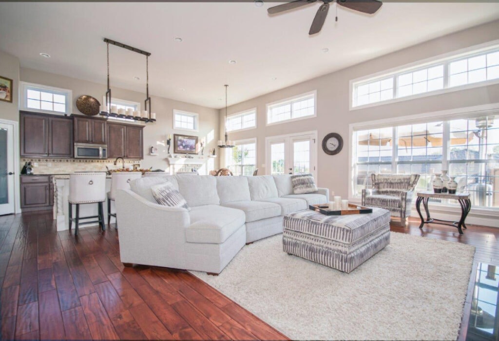
Before falling in love with a paint chip, look at what already dominates the space—these features usually shouldn’t be repainted or replaced just to match a wall color.
Start by checking:
-
Flooring tones (wood species, stain warmth, tile undertones).
-
Cabinets + countertops (they strongly influence whether paint looks too pink, too yellow, too gray, etc.).
-
Brick/stone fireplaces and large built-ins.
-
Metals and fixtures (brass, chrome, black hardware) plus large furniture pieces.
Practical rule: Choose paint undertones that agree with your fixed finishes (warm with warm, cool with cool) so the room doesn’t feel “off” or mismatched.
Step 2: Choose colors based on room direction
Room orientation is one of the fastest ways to narrow options because it predicts how daylight will push your color (cooler, warmer, flatter, or more intense).
| Room exposure | What the light tends to do | Safer paint direction |
|---|---|---|
| North-facing | Lowest light and cooler feel; cool undertones can look even colder. | Warm neutrals / warm undertones to balance the cool light. |
| South-facing | Warmer, more consistent light; overly warm colors can feel too strong at times. | Most colors work; cooler tones often look more neutral here. |
| East-facing | Warm light earlier, cooler/flatter later. | Choose based on when you use the room most; balanced neutrals work well. |
| West-facing | Cooler earlier, warmer later (often strongest in late day). | Balanced neutrals or blends of warm + cool decor to stay consistent. |
Step 3: Use LRV to control “bright vs. moody”
LRV (Light Reflectance Value) is a 0–100 scale that tells how much light a color reflects—0 is black, 100 is white.
This is especially helpful when a room is naturally dim, because higher-LRV colors can keep the space from feeling heavy.
Simple LRV ranges (easy decision guide):
-
70–90: Bright, airy (nice for darker rooms, ceilings, trim).
-
50–69: Safe “whole-home” range for many interiors.
-
30–49: Richer depth (best when the room has decent light).
-
0–29: Very dramatic (often better as accents or well-lit rooms).
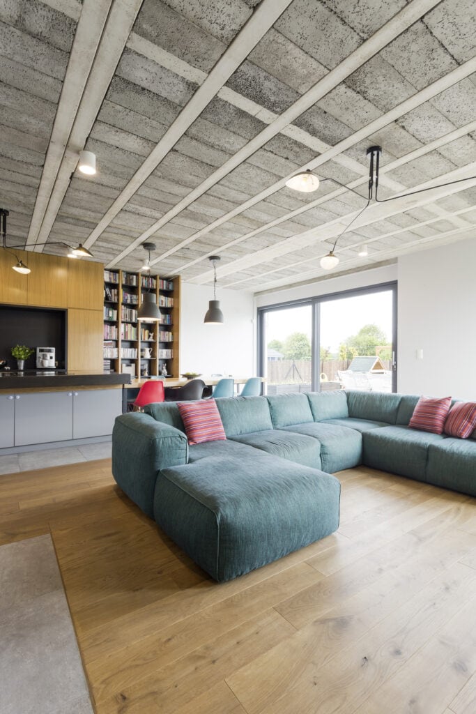
Turquoise sofa in modern living room interior
Step 4: Build a palette (not just one color)
A great result comes from choosing a small system of colors that work together across the house.
3 proven ways to build a palette:
-
Monochromatic: One color family, multiple strengths (clean, calm, upscale).
-
Analogous: Neighbor colors on the wheel (soft, natural flow).
-
Complementary: Opposites on the wheel (high contrast—use one as the main, one as the accent).
Pro tip: For open layouts and hallways, repeat one “anchor neutral” (same undertone) so everything connects visually.
Step 5: Pick sheen wisely
Paint finish affects how much light bounces off the surface—so it changes how the same color reads.
Common sheen picks:
-
Flat/Matte: Best at hiding flaws; ideal for lower-touch areas.
-
Eggshell: Popular all-around wall finish; softer look, easier to clean.
-
Satin: Great for busy walls (hallways, kids’ rooms) because it’s more durable.
-
Semi-gloss/Gloss: Usually best for trim/doors; the shine can highlight surface imperfections.
Step 6: Test the smart way
Testing isn’t optional—it’s how to avoid buying a “perfect” color that turns wrong after it’s on the wall.
How to test correctly:
-
Place samples on more than one wall (each wall gets different light).
-
Check the color in morning, midday, and evening as daylight changes.
-
Hold the sample next to flooring, cabinets, and big furniture to confirm undertones.
-
Don’t decide from a tiny chip alone—color depth changes when it covers a large area.
Need help in Columbus, OH?
If you’d rather skip the trial-and-error, a professional Columbus painting team can help you narrow choices based on undertones, lighting direction, and the right finishes—so the final result looks intentional and consistent.
 Columbus, Ohio