Color, a potent tool in branding, can communicate emotions, set the tone, and create an immediate impression that people associate with your business. Regarding physical spaces, like office buildings, retail stores, or commercial complexes, the paint color on the building’s exterior and interior serves as an extension of your brand’s identity. The colors you choose can profoundly impact how clients perceive your brand and influence their interactions with your business. In this blog, we’ll delve into the strategic use of color in building paint to reflect and reinforce your brand identity, why it matters, and how you can make thoughtful color choices to elevate your brand.
1. Understanding the Psychology of Color in Branding
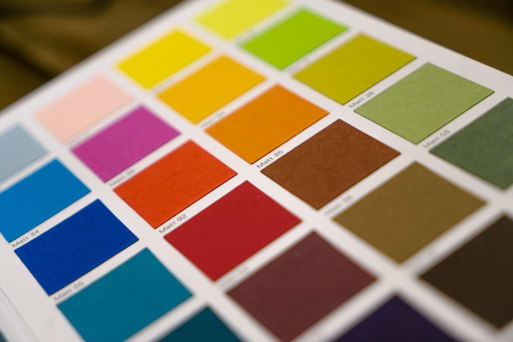
Color psychology is a well-researched concept in branding and marketing, underscoring how colors can influence perceptions and behaviors. Each color evokes specific emotions and associations, impacting customers’ feelings about your brand. Understanding these associations allows you to choose colors that effectively communicate your brand’s values and message.
For instance:
- Red is often associated with energy, passion, and urgency. Many fast-food restaurants use red to stimulate appetite and encourage quick decisions.
- Blue conveys trust, calmness, and professionalism, making it a popular choice for financial institutions and healthcare providers.
- Green represents growth, tranquility, and nature, commonly used by eco-friendly brands or those focusing on wellness.
- Yellow is bright, cheerful, and attention-grabbing, often associated with creativity and positivity, ideal for brands in the entertainment or childcare industries.
Choosing a building color scheme aligned with these psychological effects can subtly reinforce your brand’s personality. To do this, consider conducting a brand audit to identify your brand’s key attributes and then use color theory to select the most appropriate colors. Consider what emotions you want your brand to evoke, and ensure your building’s colors effectively reflect those attributes.
2. Aligning Exterior Paint with Brand Recognition
The exterior of your building is your brand’s first impression. For businesses that rely on walk-in traffic, like retail stores, restaurants, or service-based businesses, the exterior paint is key to attracting attention and encouraging people to enter. Even for office spaces and corporate headquarters, the building’s exterior color can help create a memorable presence and contribute to a cohesive brand identity.
To achieve brand recognition:
- Reflect Your Logo Colors: Incorporating colors from your logo into the building’s exterior paint helps reinforce brand recognition. For example, if your logo is predominantly green and white, incorporating those shades into the building design will help tie the physical location to your brand.
- Stand Out in the Environment: Consider the surrounding area. If nearby buildings are neutral or muted, a bold color choice might make your brand stand out more prominently. Conversely, if the area is colorful, a sophisticated or unique shade can differentiate your building subtly but powerfully.
- Consistent Branding Across Locations: Using a consistent exterior color scheme for businesses with multiple locations can help establish brand identity across all sites, making it easy for customers to recognize your brand regardless of where they are.
Aligning your building’s exterior color with your branding is a strategic way to reinforce brand identity, making it easier for customers to remember and trust your business.
3. Creating a Memorable Interior Experience with Color
The interior paint color of your building is just as important as the exterior, especially for customer-facing spaces. The interior is where customers or clients spend more time interacting with your brand, whether it’s a store, an office lobby, or a waiting area. Interior colors can influence customer moods, enhance their experience, and subtly communicate brand values.
To create a memorable and brand-aligned interior experience:
- Use Color to Define Spaces: Different colors can be used in various areas to evoke specific emotions. For instance, a financial institution might use calming blues and grays in client meeting areas to create a sense of security, while a technology company might choose vibrant greens or yellows in brainstorming areas to stimulate creativity.
- Support Your Brand Message: The color choices should reflect your brand’s message. For instance, if your brand is eco-friendly and focused on natural products, greens, browns, and earthy tones are suitable. If your brand is modern and innovative, clean whites and minimalist shades may better align with your identity.
- Match Customer Expectations: Different industries have different associations with colors. For example, a spa would benefit from soft, calming colors like pastels or light blues, while a gym might go for energizing colors like red or orange. Matching color choices with what customers expect can lead to a more comfortable and enjoyable experience, ultimately reinforcing their positive perception of your brand.
The interior color scheme should be thoughtful and consistent, creating a cohesive experience that resonates with customers and reinforces your brand.
4. Incorporating Accent Colors for Brand Distinction
Accent colors are an effective way to highlight specific elements and enhance brand visibility without overwhelming a space. Used sparingly, accent colors can be applied to specific architectural features or interior decor, such as columns, trim, or feature walls, to create focal points that reflect your brand identity.
To incorporate accent colors effectively:
- Highlight Logo Colors and Brand Elements: If your logo has a distinct accent color, you can use it on certain walls, fixtures, or details within the building to draw attention. For example, a business with a navy and gold logo might use navy for primary areas and gold accents to add a touch of sophistication and luxury.
- Add Interest and Depth: Accent colors can break up neutral backgrounds, adding depth and interest to large spaces. For instance, in an office building with neutral gray walls, a bold green accent wall could create a fresh, vibrant look that represents growth and energy.
- Guide Customer Flow: Accent colors can also subtly guide customers through space, especially in large or complex buildings. Using a particular color in entryways, along pathways, or in specific rooms can provide visual cues for navigation, creating an intuitive flow that enhances the customer experience.
Accent colors offer a flexible way to incorporate brand colors, adding personality to a space while keeping it visually balanced and brand-aligned.
5. Maintaining Brand Cohesion Across Different Locations
For businesses with multiple locations, maintaining brand cohesion in building paint choices across all sites is essential. Customers and clients should experience a consistent brand identity, regardless of the location, which fosters trust and loyalty. Ensuring that all locations use the same color palette, exterior and interior design choices, and accents can help create a unified image for your brand.
To maintain brand cohesion:
- Create a Brand Color Guide: A standardized color guide for all locations can help franchisees or different departments adhere to brand color specifications. This guide should include paint codes, acceptable color combinations, and guidance for different types of spaces within the building.
- Coordinate Design Across Locations: Whenever a new location opens, or an existing one is repainted, use the brand color guide to ensure consistency. Working with a professional painting company experienced in commercial branding projects can make this process smoother, ensuring that all colors are accurately matched.
- Adjust for Local Flavor without Losing Brand Identity: In some cases, certain color variations might be necessary due to cultural or environmental factors. However, minor adjustments to complement local preferences can be made without losing the essence of the brand colors.
By maintaining consistent color choices across all locations, your business strengthens its brand identity, making it easy for customers to recognize and feel connected to your brand, no matter where they are.
Color is more than just a visual element; it’s an integral part of your brand’s identity that can influence how people perceive and connect with your business. The colors used on your building’s exterior and interior communicate your brand’s values, evoke specific emotions, and reinforce brand recognition. By carefully selecting paint colors that align with your brand’s message, you create a cohesive and memorable experience for customers, enhancing their perception of your brand. Whether it’s the bold exterior that catches attention or the thoughtfully designed interior that welcomes clients, using color effectively can elevate your brand, making your building a powerful extension of your identity. Investing in brand-aligned building colors is a strategic move that speaks volumes about your commitment to quality and consistency, helping you stand out in a crowded market.
3S Painting specializes in crafting visually impactful spaces that echo your brand’s personality. With their expertise, you can ensure your building reflects your values and leaves a lasting impression. Trust us to transform your space into a powerful extension of your brand.
FAQ
How can the color of my building’s paint influence how customers perceive my brand?
The color of your building’s paint acts as a silent ambassador for your brand, shaping first impressions before a word is spoken. Strategic color choices can evoke specific emotions, signal your brand’s values, and even attract your ideal customer base. For example, bold colors like red or orange can make your business stand out and feel energetic, while blues and greens can convey trust and calmness, aligning with brands that value reliability or environmental consciousness.
Is it possible for building paint to tell my brand’s story, or is it just about aesthetics?
Absolutely—paint is more than just decoration; it’s a storytelling tool. The right color scheme can reflect your brand’s personality, highlight your company’s mission, and even reinforce your core values. For instance, a tech company might use modern, contrasting colors to showcase innovation, while a luxury brand may opt for subtle, elegant tones to express sophistication. Every brushstroke can be a chapter in your brand’s visual narrative.
How do I ensure my building’s paint aligns with my brand identity across all touchpoints?
Consistency is key. Your building’s paint should harmonize with your logo, marketing materials, and digital presence to create a unified brand experience. Using your brand’s primary colors as dominant shades and accenting architectural features with secondary colors can reinforce recognition and trust. This visual consistency helps customers instantly identify your brand, whether they encounter it online or in person.
Can the strategic placement of color on my building impact customer behavior or experience?
Yes, the placement of color is as important as the color itself. Highlighting entryways, windows, or unique architectural features with brand colors can guide customer flow, draw attention to key areas, and create memorable focal points. Thoughtful color placement can also enhance the mood inside your building, making spaces more inviting, productive, or relaxing depending on your brand’s goals.
What are some creative ways to use color to make my building—and brand—unforgettable?
Think beyond the walls! Incorporate your brand colors into murals, signage, and even exterior accents like doors or trim. Use color to accentuate architectural details or create visual intrigue with bold contrasts or harmonious palettes. The most memorable brands often use color in unexpected ways, making their buildings instantly recognizable and reinforcing their identity at every glance.

James Schrienk, a resident of Columbus, OH, is the proud owner of 3S Painting. With a wealth of experience in managing businesses of various scales, his expertise lies in project and people management. Jim thrives in team environments, always focusing on labor efficiency and delivering high-quality client results. His leadership style and practical communication skills have made him an exceptional manager and a driving force behind the success of 3S Painting. When he’s not leading his team to excellence, Jim enjoys continuously exploring innovative strategies to improve customer satisfaction.